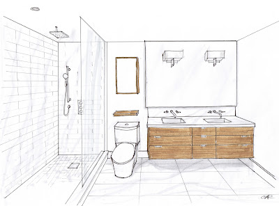
Room design and renderring by Carol Reed Interior Design
The new floor plan for The 70's Bungalow redesign has 2 bathroom ensuites and 1 powder room on the main floor (check out the before and after floor plans here, and the kitchen redesign plans here). The master ensuite and the guest room ensuite were designed with similar concepts but slightly different material selections. Each of the bathrooms would have custom wood vanities, solid stone tile flooring and solid slab counter tops.
I allocated the majority of the bathroom budgets into the floors, vanity and countertops. Everything else in the rooms would be non-custom, have simple contemporary lines and be basic white or polished chrome. I'm not a fan of mixing a lot of different tiles in one space, or using trendy tiles, these looks get dated pretty fast - I prefer to stick with classic natural stones and simple white ceramics, playing up the different shapes, sizes and finishes (honed, polished etc) for interest.
Master Ensuite room design and renderring by Carol Reed Interior Design.
Site sample board for Master Ensuite bathroom.
In addition to a full set of construction drawings, site samples boards are prepared for the contractor - they don't need to be pretty,,,just factual. Above is the site board for the Master Ensuite material finishes. Sometimes I'll include photos of the faucets and light fixtures too but this time it wasn't necessary. Final wall paint colour will be selected on site after sampling 2 or 3 draw downs on the primed walls.
Guest Bathroom design and rendering by Carol Reed Interior Design.
The guest bathroom is small but accommodates a standard size tub and a 30" vanity. The vanity had to be designed to go all the way to the floor, concealing the plumbing (that would come up thru the floor). The custom cabinet would be made from riff cut white oak stained a golden caramel colour. The countertop will be solid quartz material in white, the same white as the slim narrow rectangular ceramic tiles that will surround the tub, including the tub front and continue across the entire vanity wall. The floor will be finished with Blue Ocean vein cut travertine in an offset stack pattern which will really play up the horizontal lines in the tile. The walls will be painted a warm taupey grey. The guest bathroom will have a custom made shower curtain instead of the glass screen illustrated above, and only 1 pendant fixture instead of two.
Site sample Board for guest bathroom.
Using only one tile on the floor and one tile on the walls is a great way to stretch your budget dollars,,,and I think it maintains a clean modern look. Using a ceramic on the walls, and tiling only the shower or tub walls, instead of all the walls is also another big cost saver. To maximize a bathroom budget, keep the walls simple and get that luxe high end look by investing in stone flooring and solid countertops.
The renderings above were drawn in the early stages of the design development and it was thru these sketches that the client was able to decide on the room layout and all of the design details. Subsequently some very minor changes and modifications have been made to the bathroom design since these sketches were prepared but the overall design concept remains the same.
Last week I was out at the supplier's warehouse looking thru their current stock and tagging the orders for both of these rooms and some other areas in the house (talk about being a kid in a candy store!!). The tiler is scheduled to start in approximately 2 weeks and the vanities are in production,,,I'm so excited to see these designs evolve to the next stage.
IDS 2011
If you're in Toronto this weekend you don't want to miss the Interior Design Show at the Metro Toronto Convention Centre. I'll be at the IDC Canada booth on Saturday between 1 and 4pm participating in their Design Dilemma Consultions providing free 15 minute consultations to show attendees. If you do go and happen to see me, please stop and say hi!


0 comments:
Post a Comment